Issue 03 · June 2026 · Color
Butter Yellow
Soft, creamy yellow as the season's defining 'it' color, now styled with contrast and texture.
 Editorial · The Drop
Behind the signal
Confirmed across 10 recent news stories and 12M YouTube results this week.
Signal
Confidence
Category
ColorTrend #
08 of 18Cross-source confirmed — independent news and video signal both present this week.
News signal · 7 days
10stories
First snapshot · tracking week-over-week from here
Most recent
- Zara Tindall is beautiful in butter yellow as she joins the carriage procession on Ladies' Day at Royal Ascot
Tatler · 5 hours ago
- Kate Middleton returns to Royal Ascot in summer’s must-have shade – shop similar styles
London Evening Standard · 8 hours ago
- Here’s the Real Reason Why Butter Is Yellow
Reader's Digest · 11 hours ago
- After butter yellow, this pastel shade spotted on Emily Blunt's nails is set to dominate the summer of 2026
Paris Select Book · 12 hours ago
Video signal · YouTube
12Mresults
First snapshot · tracking week-over-week from here
Most-viewed this week
 1 HOUR OF BUTTER YELLOW SCREEN | PLAIN BUTTER YELLOW COLOR 30fps
Color Hour · 852 views
 desperately trying to style butter yellow after it plagued me through the years
Hannah Louise Poston · 24K views
 Cream Yellow Screen
COLOR · 2.6M views
 Difference Between White and Yellow Butter
Daisy Creek Farms with Jag Singh · 51K views
Pro readers see week-by-week velocity charts and comparable historical trends. Coming Q1 2027.
Four signals, four independent surfaces.
- →Named one of the biggest spring 2026 colors, spotted from Chanel to Valentino on the runway.
- →Spotted on celebrities (Jennifer Lawrence, Alexa Chung) across street style coverage.
- →Evolving toward contrast/texture versus the prior sweetness register, opening promo applications.
What to spec, who to pitch.
Butter-yellow blanks, caps, and totes for spring/summer drops. Reads fresh and premium without shouting — particularly strong for beauty, hospitality, and DTC brand programs. Pairs well with tonal embroidery for the quiet-luxury alignment.
What to put it on.
How to bring the trend through.
Where the trend lives.
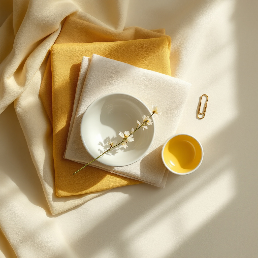
The intended visual register is editorial and warm — the product reads as wardrobe and lifestyle, not as merchandise. Use this reference to brief photography and art direction toward a considered, retail-grade feel rather than catalog-style product shots.
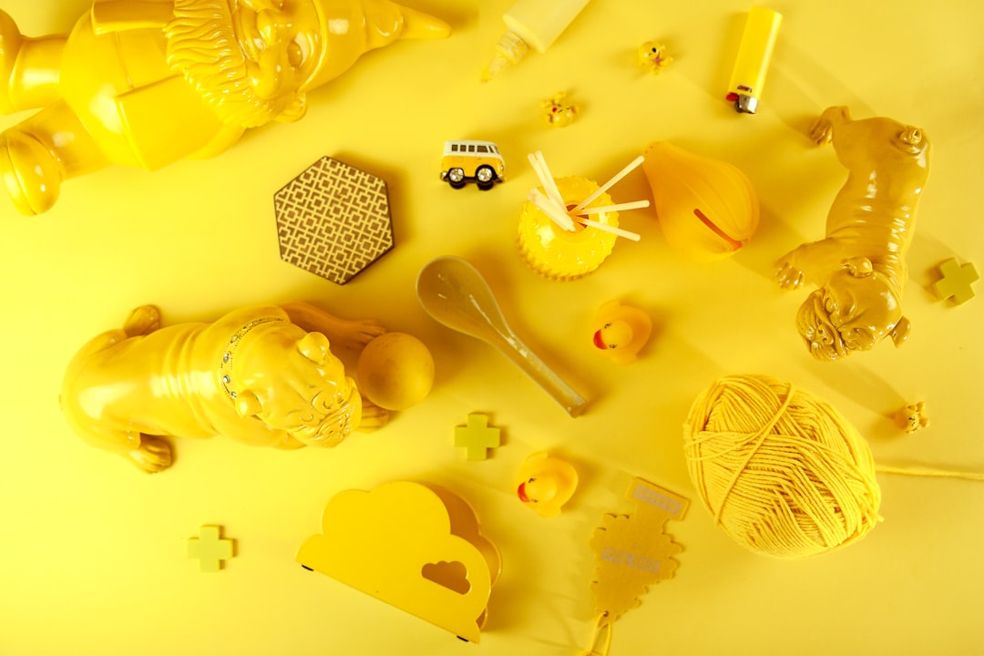
Photo by Laårk Boshoff on Unsplash
Reference points
fashion week color reporting · celebrity style coverage · retail color forecasting
Tier categories shown. Our specific source mix is part of our protected research surface.